

Overview
Undris is a multi-category intimate apparel brand serving men, women, and kids under one roof. The client came to us needing a full e-commerce web presence that could speak to three very different customer segments — without feeling disjointed, overly clinical, or generic like most underwear retail sites. The result needed to feel premium, warm, and family-oriented, while still converting visitors into buyers.
The Challenge
- Segment diversity: Men’s, women’s, and kids’ underwear each have different tones, buyer psychology, and visual language. A single homepage had to introduce all three without alienating any one audience.
- Sensitive product category: Intimate apparel requires a careful visual balance — aspirational and tasteful, not overly sexualized or clinical.
- Trust & premium positioning: As a newer brand, Undris needed a storefront that signaled quality and durability at a glance, competing visually with established intimate-wear brands.
- Conversion-first structure: Beyond looking good, the site needed a clear path from discovery (hero/category browsing) to purchase (featured products, add-to-cart) with minimal friction.
Our Approach
- Unified hero storytelling: Instead of three separate banners, we designed a single tri-panel hero image — man, woman, and children side by side — layered under one headline, “Where Comfort Meets Every Generation.” This immediately communicated the brand’s family-wide promise in one visual, rather than segmenting the experience from the first scroll.
- Clear category navigation: A dedicated “Featured Collection” section breaks the audience into Men’s, Women’s, and Kids’ with full-bleed lifestyle imagery and minimal text overlays — letting the visuals do the work of segmenting intent quickly.
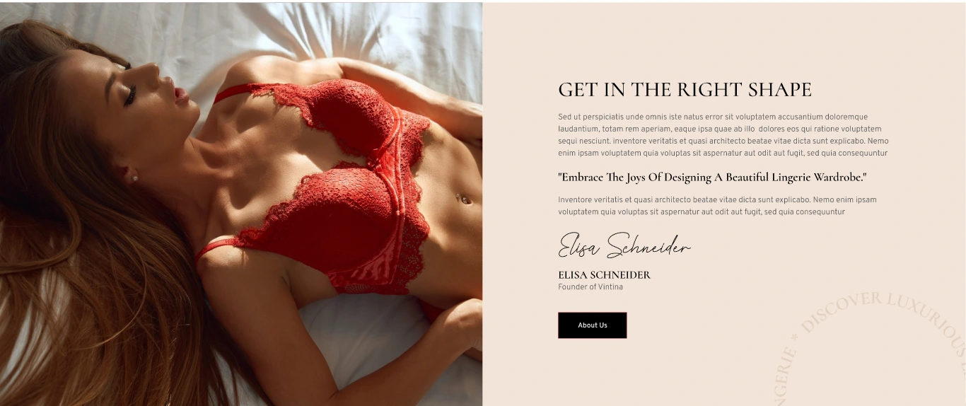
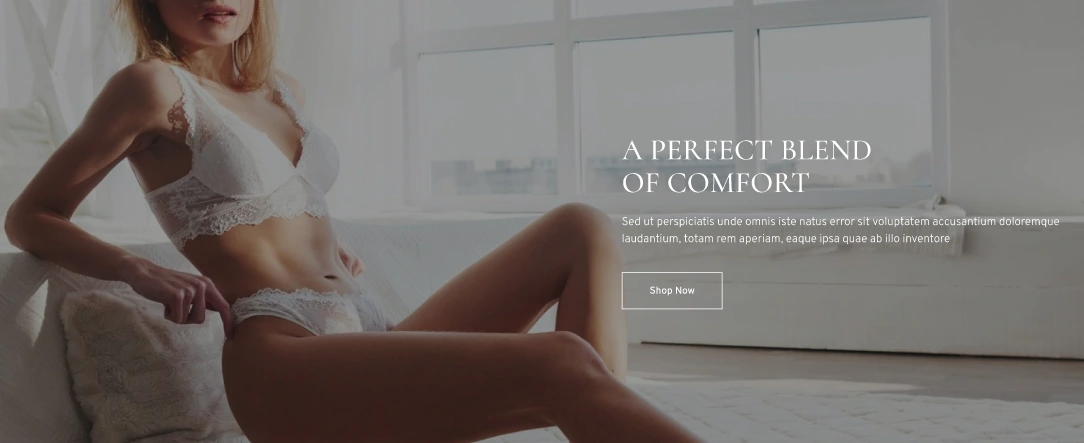
- Warm, tasteful art direction: We selected muted, warm-toned photography (soft neutrals, natural light) over stark studio lighting, positioning Undris as comfortable and premium rather than purely transactional.
- Conversion-ready product grid: Below the category split, a clean 4-up product grid (Men’s Underwear, Bra, Kids Underwear, Bra & Panty Set) surfaces bestsellers with pricing and one-click “Add to Cart,” reducing the number of steps between landing and purchase.
- Consistent brand system: A minimal top navigation (Home, About, Shop, Pages, Blog, Contact), a restrained red accent color for CTAs, and consistent typography tie the whole experience together across every section.
What We Delivered
- Full homepage UI/UX design, from hero to footer
- Tri-segment hero section with unified brand messaging
- Category browsing module (Men / Women / Kids)
- Featured product grid with e-commerce functionality (pricing, add-to-cart)
- Cohesive visual identity application (typography, color accents, imagery direction) across the storefront
- A scalable page structure ready for Shop, About, Blog, and Contact pages
Outcome
The final design gives Undris a storefront that feels like a single, cohesive premium brand rather than three disconnected product lines, while keeping the path to purchase short and clear. The layout is built to scale, with a featured collection and product-grid pattern that can easily extend to additional categories or seasonal drops as the brand grows.