Britta Ambauen
Problem / Challenges
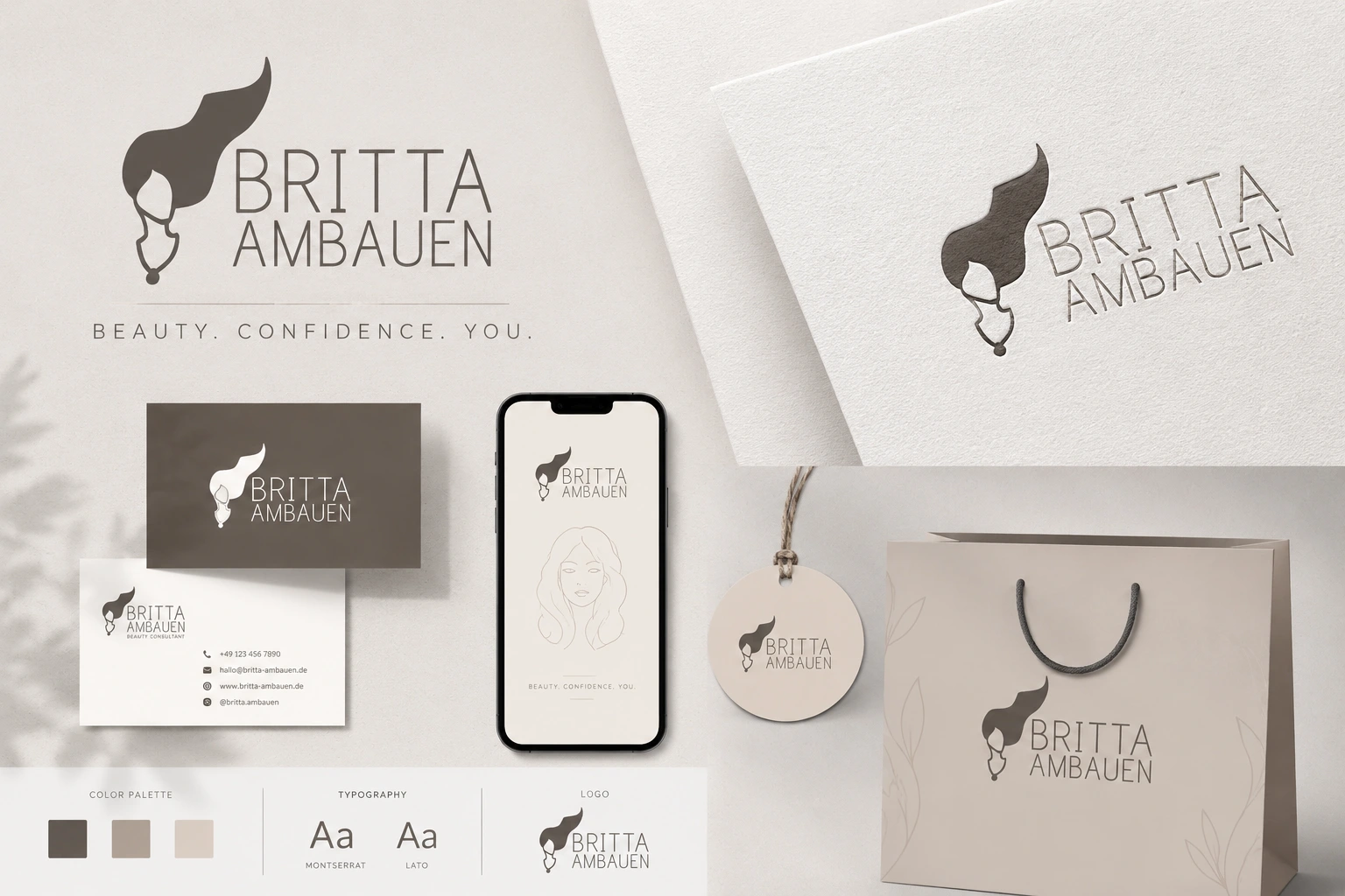
Britta Ambauen makes jewelry with intention behind every piece sterling silver, natural gemstones, designs meant to remind the wearer of something personal. That kind of brand doesn’t work with a generic, mass-market logo. It needed a mark that felt handcrafted and a little intimate, something that could sit on a tiny product tag or a hangtag without losing its identity, while still reading clearly at full size across the website and packaging. The challenge wasn’t complexity — it was restraint. A jewelry brand built on subtlety and craft needed a logo that didn’t compete with the jewelry itself.
Solution / Our Approach
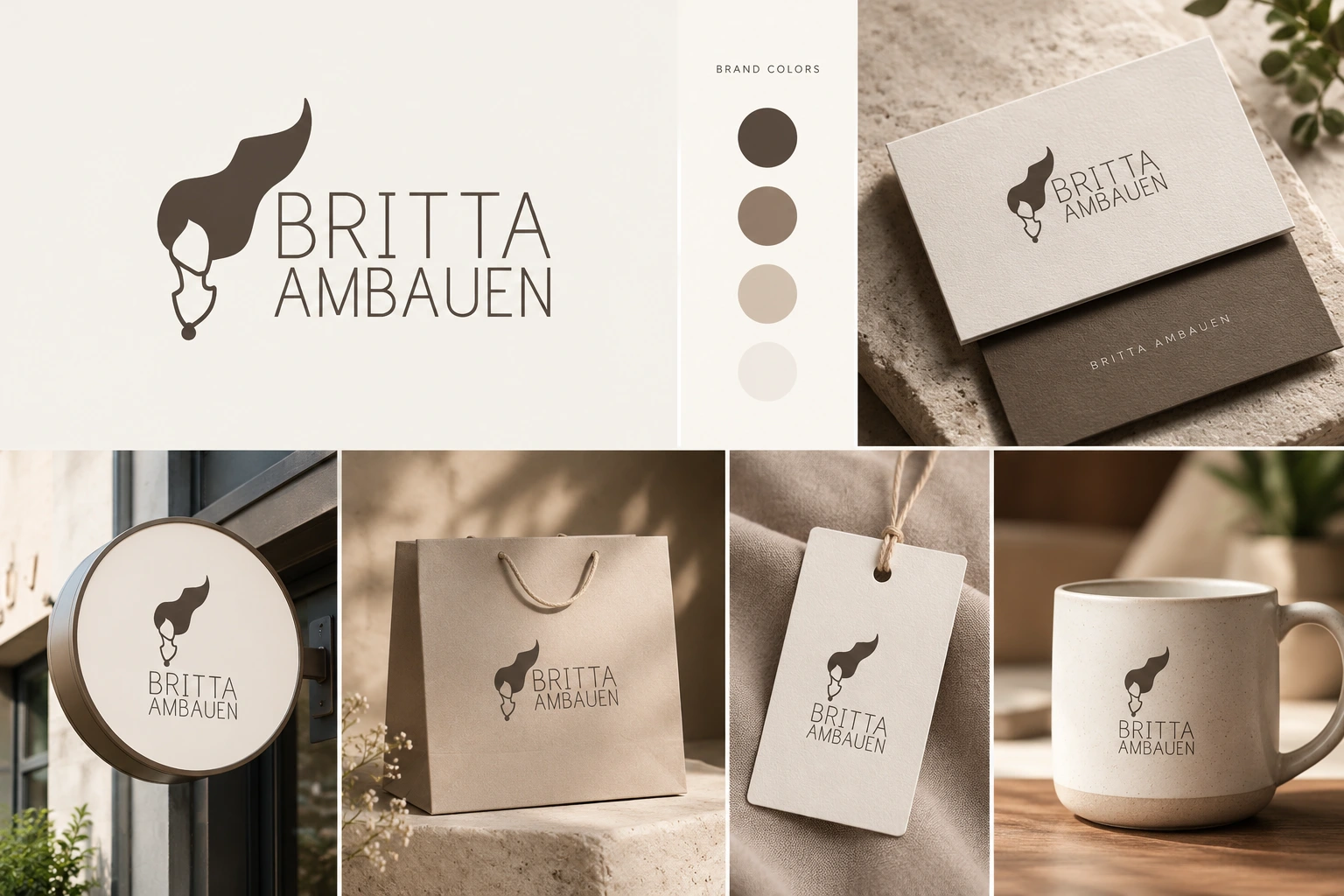
Softlogs designed a wordmark-led logo for Britta Ambauen pairing a soft, flowing linework icon with clean serif typography. The icon reads almost like a brushstroke or a piece of jewelry itself, giving the brand a signature mark it can use on its own, separate from the full logo, on things like packaging, social profile icons, or embossed tags. The typography stays simple and legible, so the logo holds up whether it’s stamped small on a velvet pouch or displayed large across the top of the website. Color was kept minimal and warm, in line with the brand’s natural, artisanal materials rather than anything that reads as corporate or trend-driven.
Result / Outcomes
The finished logo gives Britta Ambauen a consistent identity mark that scales across every touchpoint website header, product packaging, social media, and print without ever overpowering the jewelry it represents. It’s designed to age well, too: the kind of mark that won’t need a redesign every few years just to stay current, which matters for a brand built on lasting, meaningful pieces rather than fast trends.
Pull-Quote
“A jewelry brand built on meaning needed a logo that didn’t shout — Softlogs designed a mark as quiet and considered as the pieces it represents.”