
Ashante Elixir Logo Design
Problem / Challenges
When Malaika set out to launch Ashante Elixir, she needed a mark that could carry the brand’s core idea skincare as a considered ritual, not a quick transaction before a single product page loaded. Botanical skincare is a visually saturated space; a lot of brands reach for the same leaf icon or minimalist sans-serif wordmark and end up indistinguishable from each other on a shelf or a search results page. The logo needed to feel personal to Malaika’s vision, hint at the natural, botanical ingredients at the heart of the line, and still work as a small, functional mark on a product label where space is tight.
Solution / Our Approach
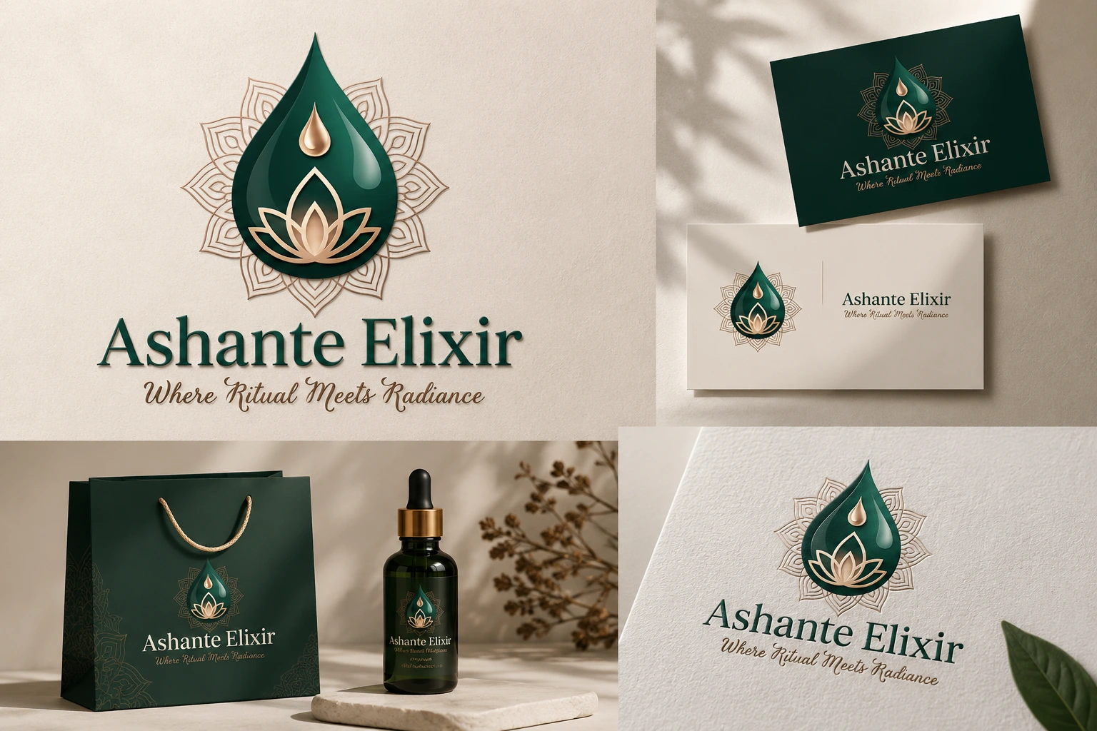
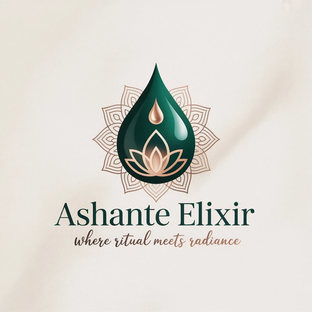
Softlogs designed a symbol-and-wordmark logo for Ashante Elixir centered on a stylized droplet-and-botanical icon, rendered in a deep teal with a soft gold accent, colors pulled straight from the brand’s natural, earthy product world rather than the more common all-green skincare palette. The wordmark uses an elegant serif for “Ashante Elixir” paired with a light italic tagline beneath it, giving the mark a boutique, apothecary feel instead of a mass-market drugstore look. The icon was built to work as a standalone mark on its own, useful for social profile avatars, product caps, and packaging seals, while the full lockup handles the website header and larger brand placements.
Result / Outcomes
The finished logo gives Ashante Elixir a mark that signals what the brand actually is before a visitor reads a single word of copy: considered, botanical, a little luxurious. It scales cleanly from a website header down to a small label on a glass dropper bottle, and it gives Malaika Ashante a consistent identity to build the rest of the brand, packaging, social presence, wholesale materials around as the line grows.
"Malaika Ashante needed a mark as intentional as her formulas — Softlogs designed a logo that feels like the first step in the ritual, not just a label on the bottle."