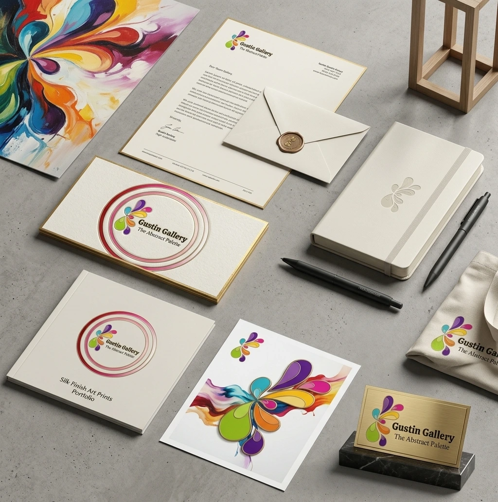
Gustin Gallery Logo Design

Problem / Challenges

Most coaching or therapy-adjacent brands lean on calm, muted colors and soft rounded type safe, but forgettable, and not particularly true to what Gustin Gallery actually does. The practice is built around expressive art as a path to healing, so a quiet, minimal logo would have undersold the brand before a visitor even reached the homepage. The mark needed to carry energy and emotion without feeling chaotic or unprofessional, a fine line for a coaching business that still needs to be trusted with something personal.

Solution / Our Approach

Softlogs designed a circular emblem for Gustin Gallery built from a burst of abstract, petal-like color forms in pink, purple, and blue, wrapped in a soft gradient ring. Paired with a clean serif wordmark and the tagline “The Abstract Palette,” the logo reads as art first and business second, exactly the order Gustin Gallery needed. The circular format also gives the mark a natural home as a standalone icon for social profiles and favicon use, separate from the full lockup used across the site and print materials.

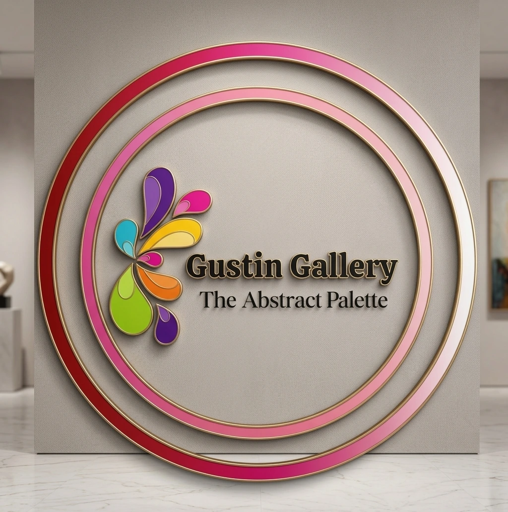
Result / Outcomes

The finished logo gives Gustin Gallery a visual signature that feels consistent with everything the brand stands for expressive, warm, a little unconventional, while still holding up as a clean, recognizable mark across web, social, and print.

Cart (0 items)
Close

Our approach is straightforward— prioritizing functionality, speed, and clarity for solutions.

WANT IT TO SOUND PLAYFUL, LUXURIOUS, OR MORE/
Select the fields to be shown. Others will be hidden. Drag and drop to rearrange the order.
  • Image
  • SKU
  • Rating
  • Price
  • Stock
  • Availability
  • Add to cart
  • Description
  • Content
  • Weight
  • Dimensions
  • Additional information
Click outside to hide the comparison bar
Compare